Mar 15, 2022
NASA App UI Redesign
Context
This was an individual project of the Ironhack UX/UI Design Bootcamp, and it's based on redesigning a well-known native mobile app. I chose NASA's App, the official app for the National Aeronautics and Space Administration that provides the public with access to a wide range of space-related content, including real-time mission updates, images, videos, and educational resources.
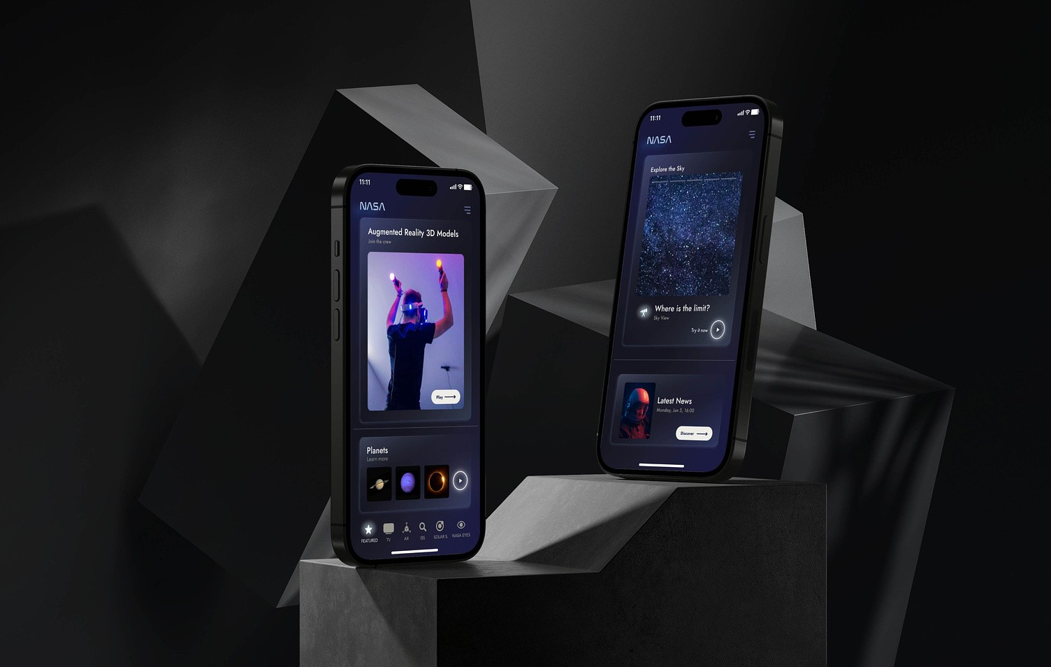
I choose to redesign the user interface of three main screens: Home, Featured and Sky Map screen aiming to serve as an inspiration for a new concept design proposal with the intention to match NASA's brand experience, experimenting with a more innovative approach.
The process
By following the Design Thinking methodology I completed tasks including User Research, Heuristic Analysis, Competitive Analysis, Atomic Design, User Testing, and Concept Testing that led me to deliver a High-Fidelity Prototype including testing in all the stages of the process: Concept, Usability and Desirability testing.
The challenge
To improve NASA's UI, I needed to create a new User Interface to improve usability and engagement, thereby elevating user satisfaction and leading to attracting diverse users and expanding market reach. I believed a new UI can set the product apart, driving user loyalty and outshining competitors. The timeline for this project was only 3 days. Given the limited timeline, our primary objective for this project was to enhance our visual and user interface (UI) skills, rather than focusing extensively on user experience (UX).
01 Discovery
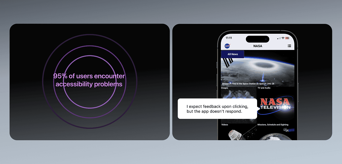
To kickstart the project, I conducted five user interviews to understand better how users perceive NASA's App. These interviews allowed me to uncover valuable insights into users' unmet needs and pain points, shaping the direction of the redesign. I documented these findings and organized them using an Affinity Diagram, which proved invaluable in detecting user patterns and identifying opportunities for improvement.
Empathizing with users and analysing the market
To foster innovation and creativity, I looked beyond the space industry and I did a benchmark analysis against leading brands like Tesla, TikTok and Spotify. Analysing their design solutions, I gained valuable insights into what makes a product truly stand out.
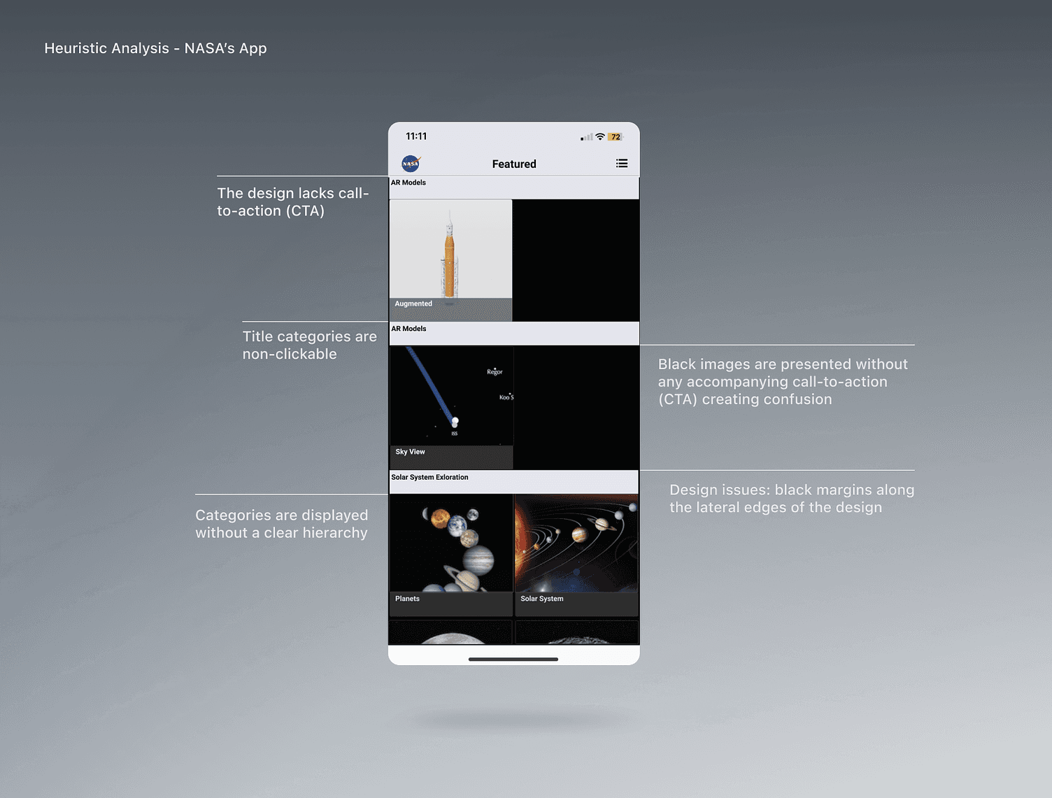
For a comprehensive analysis of the main issues across the three screens, I duplicated and individually assessed them using Nielsen’s heuristics, evaluating each problem based on its impact in hindering users from reaching their goals.
Key insights
These were the main problems encountered:
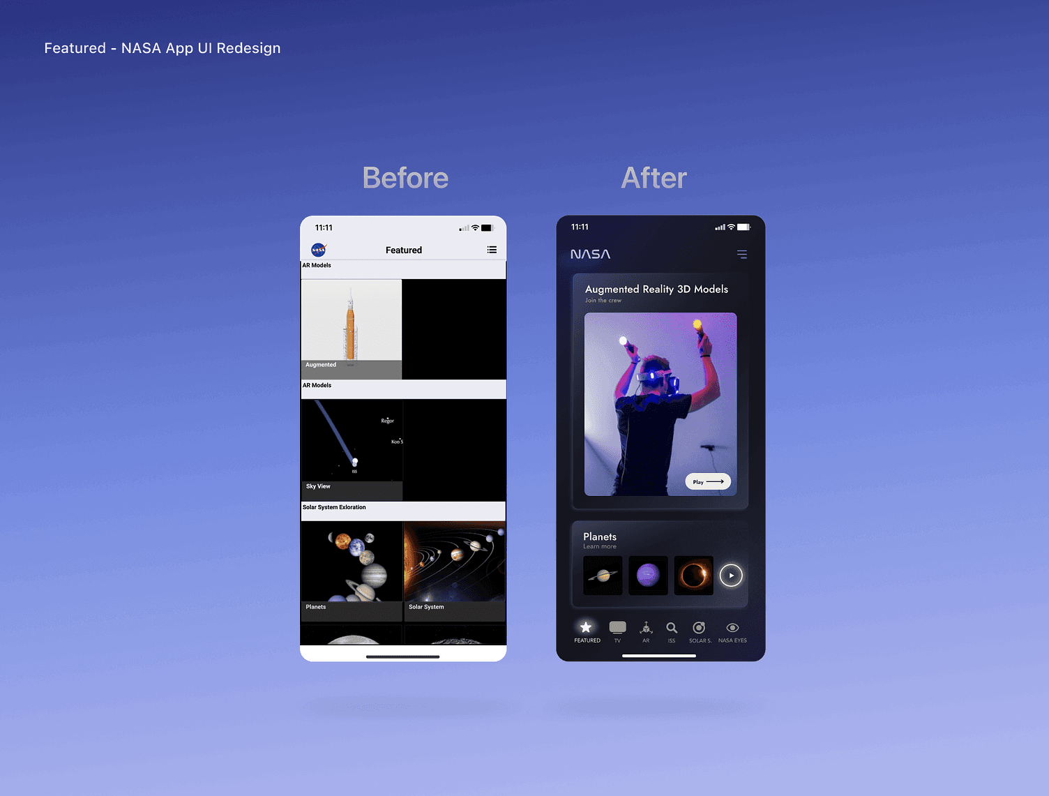
The current design lacks a call-to-action (CTA) and displays categories without a clear hierarchy.
Users are required to scroll down to view the last row and see the full-sized image, risking missing the lower part of the image or assuming there is more content below.
Title categories, such as ‘AR Models,’ are non-clickable. Additionally, black images are presented without any accompanying call-to-action (CTA).
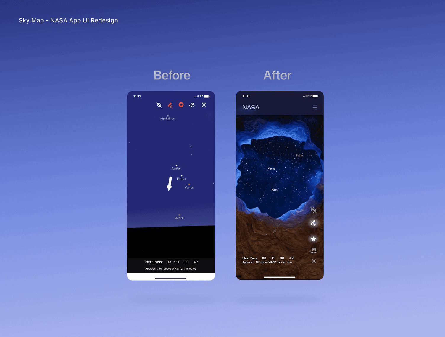
The preselected icons being in red colour can be confusing for the user as now works when the user is activating the future, but red can be associated with an error.
The Sky Map menu lacks accessibility, and the Star typography is only utilized in one section and does not reappear throughout the app.
02 Define
During the Define phase, I synthesized information from the empathize phase to pinpoint core challenges and created the problem statement, a crucial asset in the process as it helps define the user's pain points and objectives with clarity, guiding the design process towards user-centred solutions.
To move forward, I employed the How Might We technique to transform complex challenges into actionable design opportunities. By framing problems as open-ended questions, this technique helped me to explore a range of potential solutions. This approach shifted the focus from problems to possibilities, fostering innovation and ensuring that user needs are at the forefront of the design process.
03 Ideation
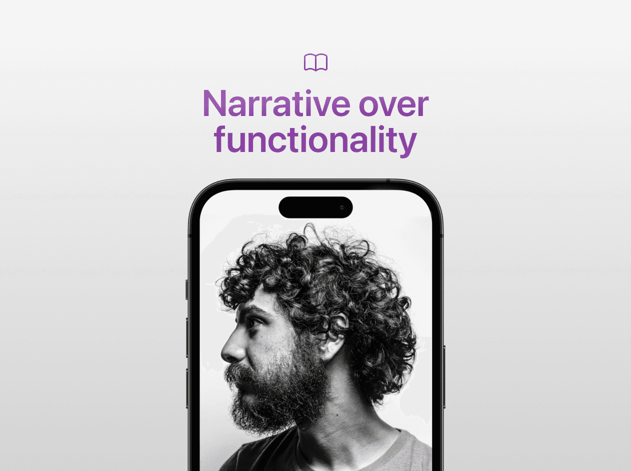
Considering the conventional dynamics of user-system interaction, characterized by intricate navigational layers leading to desired content – a process often laden with complexity – I tried to envision a contrasting scenario: a proactive system that foresees user requirements and engages as users interact. I leverage narrative principles to shape the foundation for the problem-solving methodology:
User-centred flow: Prioritize users' needs for a seamless journey.
Consistent visuals: Maintain uniformity in design elements for familiarity (and create new assets that are aligned with the brand's values).
Clear information hierarchy: Guide users' focus with visual cues.
Progressive disclosure: Unveil features gradually for a non-overwhelming experience.
Emotional engagement: Evoke feelings through storytelling elements.
Focusing on idea generation, I translated the problems encountered into solutions. I explored a variety of solutions and used Crazy 8s to generate lots of ideas in a short period of time before delving into the details. I also did Concept Sketching, starting to design new ideas before moving to the next phase.
04 Prototype
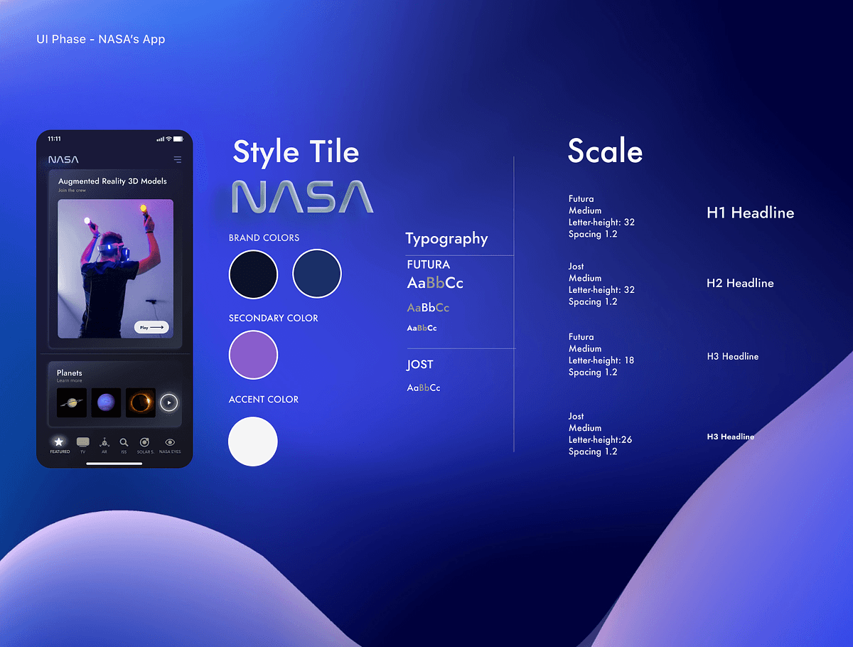
During the Prototype phase, I conducted Concept and Usability testing, after which I transitioned to the visual aspect, incorporating all gathered information. I developed a moodboard and defined NASA's brand attributes, which informed the creation of the Style Tile to set the design concept's visual direction (attributes explain)
Additionally, I employed Atomic Design to deconstruct UI components into reusable building blocks, collaboratively ensuring a cohesive and scalable user interface.
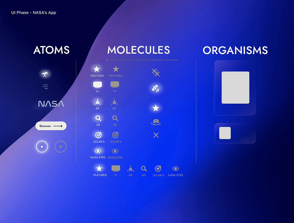
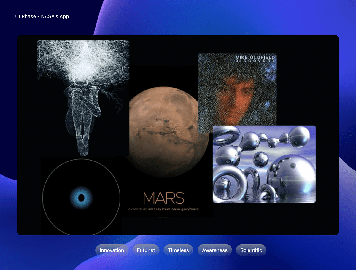
High Fidelity Prototype
I tested this first prototype on a small group of 3 people in person to identify any major issues before I test it on a larger group and decided on the final design.
Breaking out the new NASA App Design
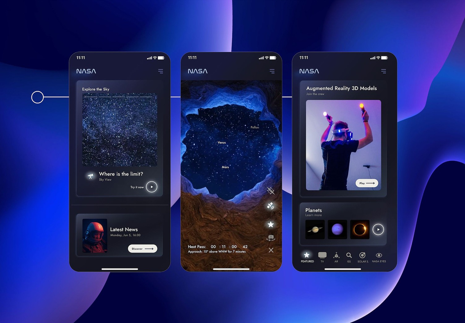
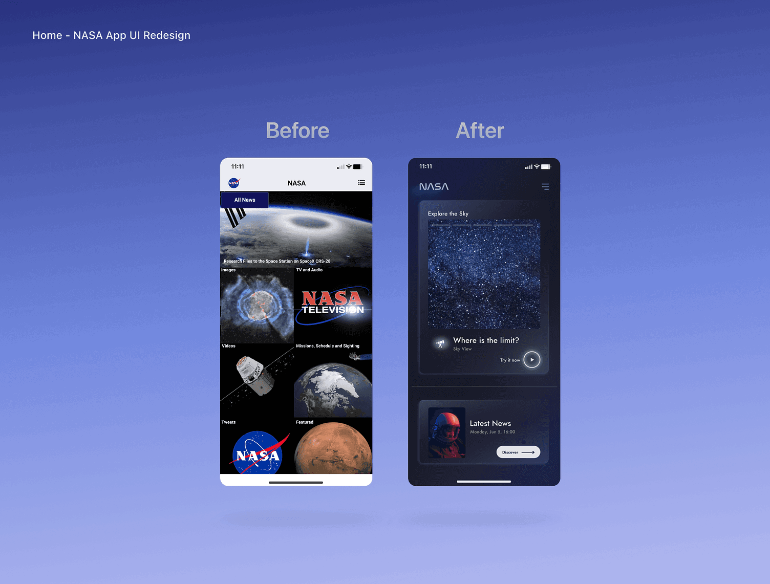
#1 Home screen: before and after
I cloned NASA's home screen and compared it with the new design that I have created. In the new design, users can immediately access main categories through video stories, accompanied by a clear call-to-action (CTA) for interaction. The interactive video story component creates a dynamic, immersive experience by combining visuals and motion, enhancing user engagement and extending their time within the app.
The proposed design prioritizes navigation ease, featuring a clear and intuitive system that enables seamless movement between various stories and app sections. This approach aims to minimize bounce rates and elevate the overall user experience. For a future integration in NASA's app, I would recommend integrating personalization into their home screen. This customization could tailor video story content according to user preferences and behaviours, leading to heightened relevance and a substantial increase in user engagement.
#2 Featured screen: before and after
For the new featured screen, I wanted to enhance user experience (UX) and refine the user interface(UI), displaying the menu to optimize accessibility, and facilitating smoother interactions. Additionally, I introduced two components featuring a horizontal scroll, which not only enriched the UI but also amplified navigational ease. To bolster the visual appeal, I curated more captivating images, thus fostering a more engaging and aesthetically pleasing user interface.
#3 Sky Map screen: before and after
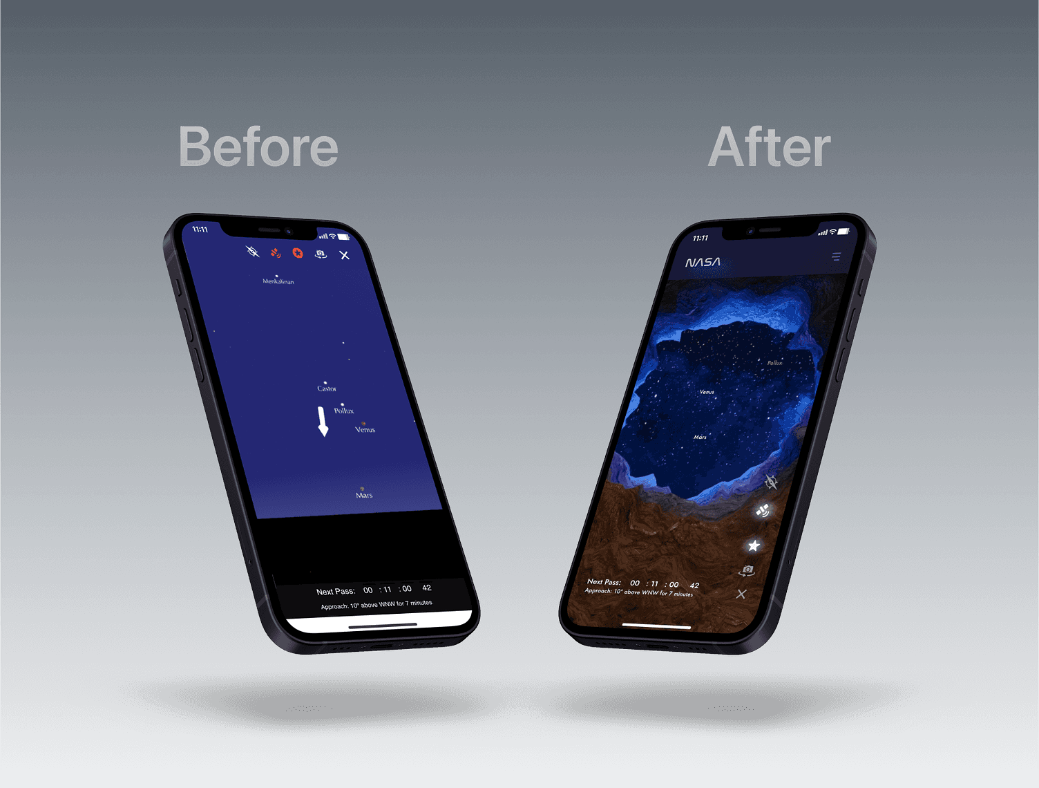
To enhance the Sky Map screen, I opted to redesign the graphics and reposition the app menu to the right side of the User Interface (UI) to ensure improved accessibility. Placing the menu on the right aligns with the natural thumb movement. This arrangement diminishes strain and enhances navigation comfort, particularly for users with larger devices.
Users' familiarity with right-aligned menus minimizes the learning curve, while the increased screen space for content keeps focus and engagement high. This modification also extends enhanced accessibility to users with limited mobility or those who employ their devices with one hand due to disabilities. For these users, the menu positioned on the right enhances accessibility and promotes inclusivity, ensuring a more fulfilling app experience.
05 Testing
I began the testing phase by working with smaller user groups, conducting Concept, Usability, and Desirability tests, which revealed multiple usability issues. Once identified, I thoroughly addressed these concerns.
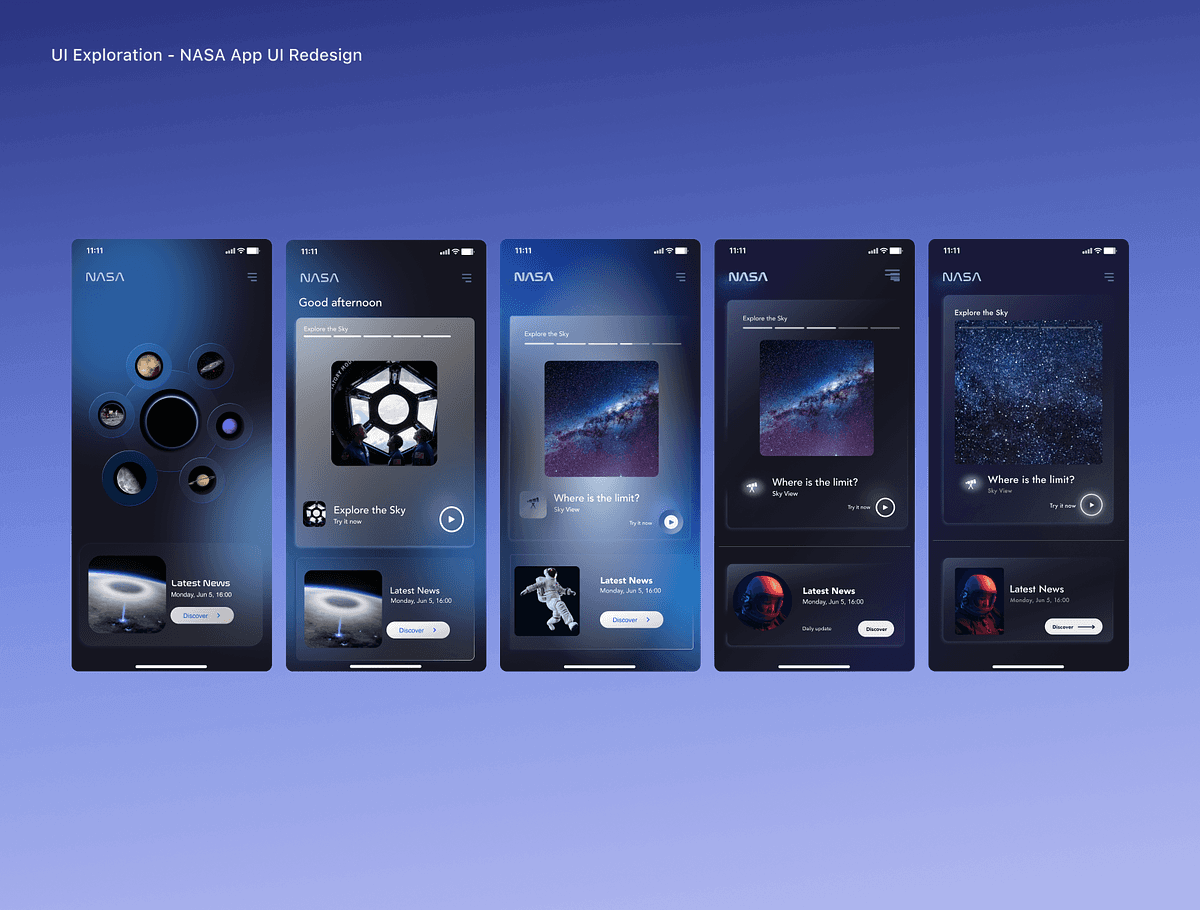
The initial prototype featured a home screen with a wheel menu, which users found challenging to grasp. Feedback suggested the need to simplify the experience while introducing fresh elements that would captivate their attention.
In response, the second prototype integrated stories to streamline navigation. Feedback revealed a user challenge in identifying categories effortlessly.
The third prototype aimed to address this by introducing category icons for enhanced visual identification. Testing highlighted a need for increased contrast due to the light background's impact on accessibility.
Subsequently, the fourth iteration involved a darker background, which was positively received. Users expressed a desire for larger story thumbnails. Taking this into account, the final version accentuated story prominence, transitioning to video format to heighten user engagement and capture attention effectively.
Learnings
One of the pivotal stages in this project was the Heuristic Analysis and Competitor Analysis. These analyses helped me identify areas for improvement and opportunities to design a more unique proposal that maintains focus on the app’s features while communicating hierarchy in a clear and modern manner.
© 2023 Horizontal. Theme by @justinmfarrugia